sectionsGrid
This type allows to configure the page sections. The configuration needs to be done on scope level, i.e. for each page type.
Attributes:
- config
Determines the order of the sections and their state in JSON format. The following attributes are available:sectionId: internal name of the section, the possible values depend on the type of page:
Case creation page: customfields, customers, comment
Case details page: customfields, customers, relations, calendar, resources, history, attachments
Person details page: customfields, calendar, tickets, additional_details, relations, resources, history
Company details page: customfields, calendar, tickets, contacts, additional_details, relations, resources, history
Resource details page: customfields, additional_details, calendar, resource_relations, unit_relations, ticket_relations, history
row: row which the section will be placed in, starting with 1
col: column which the section will be placed in, starting with 1
state: initial state of the section when loading the page, possible values: expanded, collapsed or hidden
positionInCell: optional, only relevant if several sections are displayed in the same cell (same column and same row), defines the order of this section in the cell, starting with 1
Configurations with two sections in a row will only take effect if the users’ screen offers enough space. The grid mechanism will automatically fallback to one section per row if the screen size / resolution of the user is not sufficient. This behavior can be changed via CSS skinning.
Configuration examples
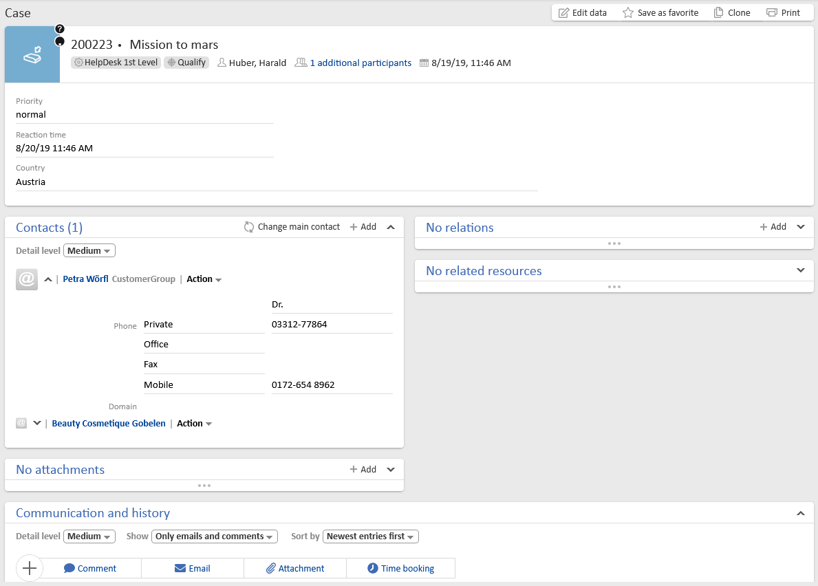
The following example shows a layout with two columns for sections which usually have few content.
JSON configuration:
[{"sectionId":"customfields","row":1,"col":1,"state":"expanded"}, {"sectionId":"customers","row":2,"col":1,"state":"expanded"},{"sectionId":"relations","row":2,"col":2,"state":"expanded"}, {"sectionId":"attachments","row":3,"col":1,"state":"expanded"},{"sectionId":"resources","row":3,"col":2,"state":"expanded"}, {"sectionId":"calendar","state":"hidden"}, {"sectionId":"history","row":5,"col":1,"state":"expanded"}]
Result:
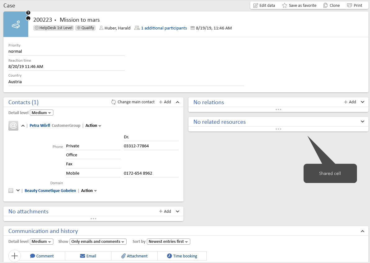
The following example shows a layout with two columns and a shared cell for case relations and resource relations. Sharing cells can be useful if you expect much content in the sections in one column, so that several sections can fit in the column next to it.
JSON configuration:
[{"sectionId":"customfields","row":1,"col":1,"state":"expanded"},{"sectionId":"customers","row":2,"col":1,"positionInCell":1,"state":"expanded"},{"sectionId":"attachments","row":2,"col":1,"positionInCell":2,"state":"expanded"},{"sectionId":"relations","row":2,"col":2,"positionInCell":1,"state":"expanded"},{"sectionId":"resources","row":2,"col":2,"positionInCell":2,"state":"expanded"},{"sectionId":"calendar","row":3,"col":1,"state":"hidden"}, {"sectionId":"history","row":4,"col":1,"state":"expanded"}]
Result:
Adapting the configuration in a script
You can create a script of the type Page customization and reference it in the configuration script field to enable further customizations, e.g. to implement a specific layout for each queue.
The following syntax can be used to return the configuration in the script:
return [config:"""[
{sectionId:customfields,row:1,col:1,state:expanded},
{sectionId:customers,row:2,col:1,positionInCell:1,state:expanded},
{sectionId:attachments,row:2,col:1,positionInCell:2,state:expanded},
{sectionId:relations,row:2,col:2,positionInCell:1,state:expanded},
{sectionId:resources,row:2,col:2,positionInCell:2,state:expanded},
{sectionId:history,row:3,col:1,state:expanded},
{sectionId:calendar,state:hidden}]"""]