The Different Data Fields
This section describes the different kinds of data fields which are used in the Web Client.
Red Asterisks
A red asterisk indicates that a field is mandatory. It has to be filled out before you can save your changes to the current page. This applies to all types of data fields.
Data Entry Fields
You can enter text or numbers in data entry fields. Some fields have restrictions, e.g., it might be possible that a certain field only accepts numbers. The meaning of a data field, i.e., the kind of data you should enter there, can be indicated by a label, an inline text, and/or a tooltip.
Date Fields
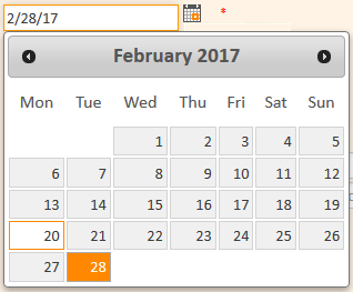
Date fields are indicated by a little calendar icon. If you click the calendar icon, a calendar opens and you can pick the desired date. You can also enter the date manually.
Text Boxes
You can enter text into text boxes. Compared with data entry fields, text boxes are provided for longer text entries which can also contain line breaks, e.g., longer comments.
If you click the lower right corner of a text box, you can drag it to enlarge the size of the box.
Links
Some text fields can be configured to contain a link to open a website or file, or write an email. These text fields look like normal text fields but you can only enter a valid path. Otherwise the Web Client shows an error message. In view mode you can click the link to open the website or file, or to write an email using your email client.
The following formats are allowed:
- URLs have to start with http:// or https://, e.g. http://www.consol.de
- File links have to start with ftp:// or ftps:// if the file is saved on an FTP server, or file:// if the file is saved on a file server, e.g. ftp://ftp.consol.de/myfile.doc or file://fileserver/myfile.doc
- Email addresses have to start with mailto:, e.g. mailto:luke@consol.de
If you do not use any of the above mentioned protocol identifiers, the system assumes the your link starts with http://.
You can enter a display name for the link by typing a space and entering the text to be displayed instead of the link. For example, http://www.consol.de ConSol Website is displayed as follows:
Checkboxes
Checkboxes can be activated (checkmark is set) or deactivated (checkmark is not set). An activated checkbox means yes, a deactivated one means no.
Radio Buttons
Radio buttons let you choose between different values. Click the radio button with the desired value to select it. You can only choose one value from a group of radio buttons, i.e., multiple values are not possible here.
Drop-down Lists
Drop-down lists contain a list of predefined values. When a drop-down list is displayed grayed out, you cannot choose data, because you do not have the necessary permissions or data entry is not intended at this point. You can only choose one value from the list.
Autocomplete Lists
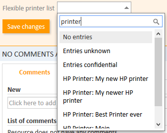
Autocomplete lists are dynamical lists. You can enter a keyword to display the corresponding objects (engineers, customers or resources) in the list. Then you select the desired object. The above figure shows an autocomplete list with three fixed entries (No entries, Entries unknown and Entries confidential) and four resource objects of the resource type HP Printer, which have been found using the keyword print.
Hierarchical Lists
Hierarchical lists can be displayed as MLA (Multi Level Attribute, displayed in a box) or as individual drop-down lists. They provide tree-like data structures, which allow you to select the desired value by navigating through a hierarchy.
MLA (Multi Level Attribute)
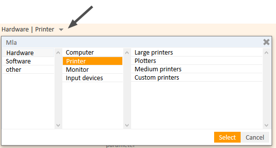
To select a value within an MLA, click the little arrow to open the box (see above figure). Select an entry from the first list on the left. If the selected entry has a little arrow next to the value, a new list is opened to its right. The values available in the new list depend on the chosen entry. This way you can navigate through several hierarchical levels. You can click Select to select the current entry at any time.
Dependent Drop-Down Lists
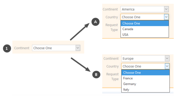
To select a value, choose an entry from the first drop-down list. Depending on your selection, additional drop-down lists are displayed and/or the values available in the other drop-down lists change.
The above example shows that after choosing America under Continent, the additional drop-down list SubContinent appears. Also, the entries available in Country vary depending on the selected continent.
Tables
Tables can contain data entry fields, drop-down lists, MLAs, or checkboxes. For some tables it is possible to add rows by clicking Add row (1) and/or to delete rows by clicking the cross icon at the end of a row (2).


