Usability improvements for the Web Client
The following usability improvements for the Web Client have been made.
Filtering the case history by text class (#629319)
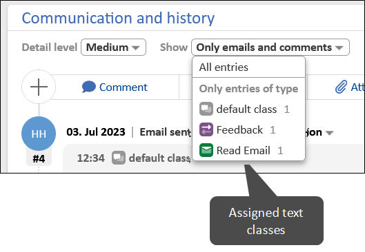
The case history can now be filtered to show only comments and emails with a selected text class. The Show selector has been extended with the list of text classes which are assigned to comments and emails which are currently visible in the case history.

The filtering only applies to the entries which are visible in the selected detail level. Text classes applied to hidden entries are not available for selection.
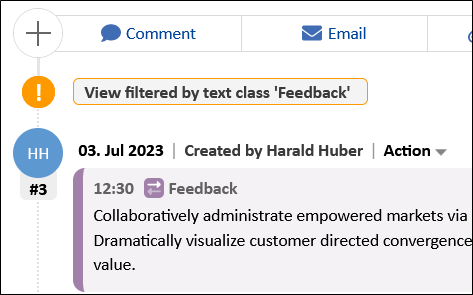
If a filter is applied, a warning is shown at the top of the case history.

Warning messages displayed in yellow (#629997)
Warning messages, which can be implemented by using the method client.showWarningMessage("message text"), are now displayed with a yellow background color to differentiate them from the green info and success messages.
Recently visited pages shown in avatar menu (#657751)
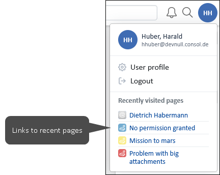
The user avatar menu, which is accessed by clicking the user initials in the right corner of the menu bar, now includes a section with the recently visited pages. This allows the user to easily navigate to the cases, contacts and resources which he has viewed last. Up to 10 items can be shown.

Improved layout of confirmation dialogs (#657821)
The visual presentation of the dialog to set the escalation date and the dialogs which are shown to ask the user for confirmation before performing certain actions has been enhanced. It is now consistent with the general design of modal dialogs.
Comments and attachments section of contacts and resources improved (#657944)
The design of the Comments and attachments section on contact and resource pages has been improved. It is now responsive and consistent with the respective sections on case pages, i.e.
- The new table component with the buttons Download selected, Download all and Delete selected is used in the Attachments tab.
- The Comments tab shows the new table components with a Delete selected button which allows removing several comments at once.
- The tables for comments and attachments cannot be filtered.
- Content can now be added only via the section header buttons Add comment and Add attachment.

Improved layout of dialog to edit comment (#658162)
The visual presentation of the dialog to edit a comment has been enhanced. It is now consistent with the general design of modal dialogs.
Improved layout of resubmission dialog (#658163)
The visual presentation of the resubmission dialog has been enhanced. It is now consistent with the general design of modal dialogs.
Improved layout of widget dialogs (#658166)
The visual presentation of the dialogs to show all items of the Recent changes and Recently visited widgets has been enhanced. It is now consistent with the general design of modal dialogs.
Improved layout of rich text field dialog (#658167)
The visual presentation of the dialog to show the content of rich text fields with the value Link for the setting Rich text display in view mode has been enhanced. It is now consistent with the general design of modal dialogs.
Improved layout of calendar dialogs (#658320)
The visual presentation of the dialogs to create and edit calendar appointments has been enhanced. It is now consistent with the general design of modal dialogs.
Improved usability when adding attachments (#658541)
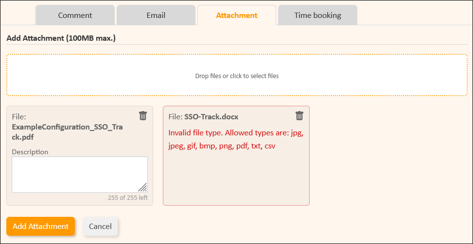
When adding attachments to a case, the uploaded attachments are now shown in boxes below the drop area to use the available screen with in an optimal way and make this component responsive. The field to enter a description is now larger and the number of used characters and maximum characters is shown below the text area.

Improved layout of change history dialog (#659044)
The visual presentation of the dialog to view the change history of edited comments has been enhanced. It is now consistent with the general design of modal dialogs.
Improved layout of session timeout dialog (#659270)
The visual presentation of the dialog which is shown to warn the user that a session timeout is about to occur has been enhanced. It is now consistent with the general design of modal dialogs.
Improved layout of search saving dialog (#659330)
The visual presentation of the dialog which is shown when the user wants to save a detail search to the favorites has been enhanced. It is now consistent with the general design of modal dialogs.
Contact search feature streamlined (#659343)
The display of the field to search for contacts on the page to create a case or person is not configurable anymore. There is always a wide search field with the watermark Search by name, email, address .... When hovering the field, a tooltip with an explanation is now shown.
The page customization attribute aidLevel in the type unitSearch has been removed because it is not needed anymore. The behavior of the previous value “EXTENDED” is now used as a standard behavior.
Viewing of cases from the workspace improved (#660376)
When viewing a case which is saved to the workspace and has been changed by another user in the meantime, a green info box is now displayed at the top of the case to explain this situation. The user can click the Reload and lose local workspace changes button to discard his unsaved changes from the workspace and view the latest state of the case.
The message is not removed automatically, even if it is configured that green messages disappear after a certain time period (page customization attribute successMessageTimeout in the type generalFeedback).
New ConSol CM logo (#660941)
The ConSol CM logo which is shown on the login page and in the upper left corner of the Web Client has been replaced with a new one with rounded corners which matches the overall styling of the application.