Usability improvements for the Web Client
The following usability improvements for the Web Client have been made.
Editing attachment descriptions (#655657)
The users can now edit the descriptions of existing attachments in open cases. This allows them to enhance the initial description entered during the attachment upload, and provide additional context for attachments created automatically, e.g. by an incoming email.
Editing can be initiated in two places:
- Case history: Click Edit attachment description in the context menu of the attachment entry.
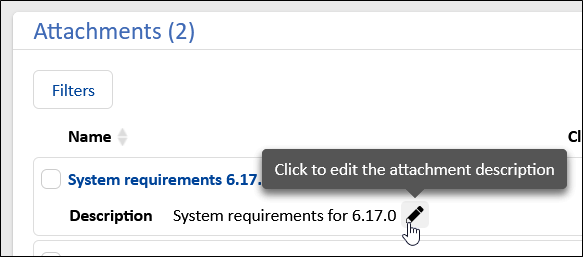
- Attachments section: Click the pen icon next to the description of the attachment.

This opens a modal window which allows the user to add a description or to update the existing one. The change will be logged in the case history to ensure traceability and accountability.
The descriptions of attachments which are duplicated because they were used in outgoing emails prior to this update cannot be edited. They will remain as independent copies, and only the description of the original attachment from the case can be modified.
Clickable links in plain text emails (#657186)
The URLs, which are allowed in the system property ticket.from.incoming.message.accepted.links from the module cmas-core-server, are now rendered in a clickable way in incoming plain text emails and in incoming HTML emails which include the link without link tag. Previously, only HTML emails could contain clickable links in the respective HTML tags. Therefore, the behavior is now the same for both types of emails and matches the user expectations set by common email clients.
Direct feedback on email status (#658000)
When sending an email from the Web Client, the status of the send process is now shown in a badge in the header of the respective history entry.
While the email is being sent, the badge is yellow to indicate an action in progress.
Afterwards, it either turns green if the email was sent successfully, or red, if there was an error. In the latter case, a detailed tooltip provides more information, and a Retry sending button is available for immediate resending. Therefore, the users will no longer need to reload the page to confirm if an email was successfully sent or if it failed.
This real-time feedback improves the user experience by making the email sending process transparent and efficient, even when operating asynchronously.
Removing comment content (#658847)
When editing their own comments, the users are now able to remove the comment content because it is not mandatory anymore. After saving, the text (Empty or deleted content) is shown in the case history.
New detail search criterion for cases added (#659167)
The users can now search for cases which they modified by using the new criterion Changed by me. They can limit the search to certain types of changes and specify the timeframe of the modification.
This allows the users to easily locate the cases which they have worked on recently.
Layout of detail search improved (#659233)
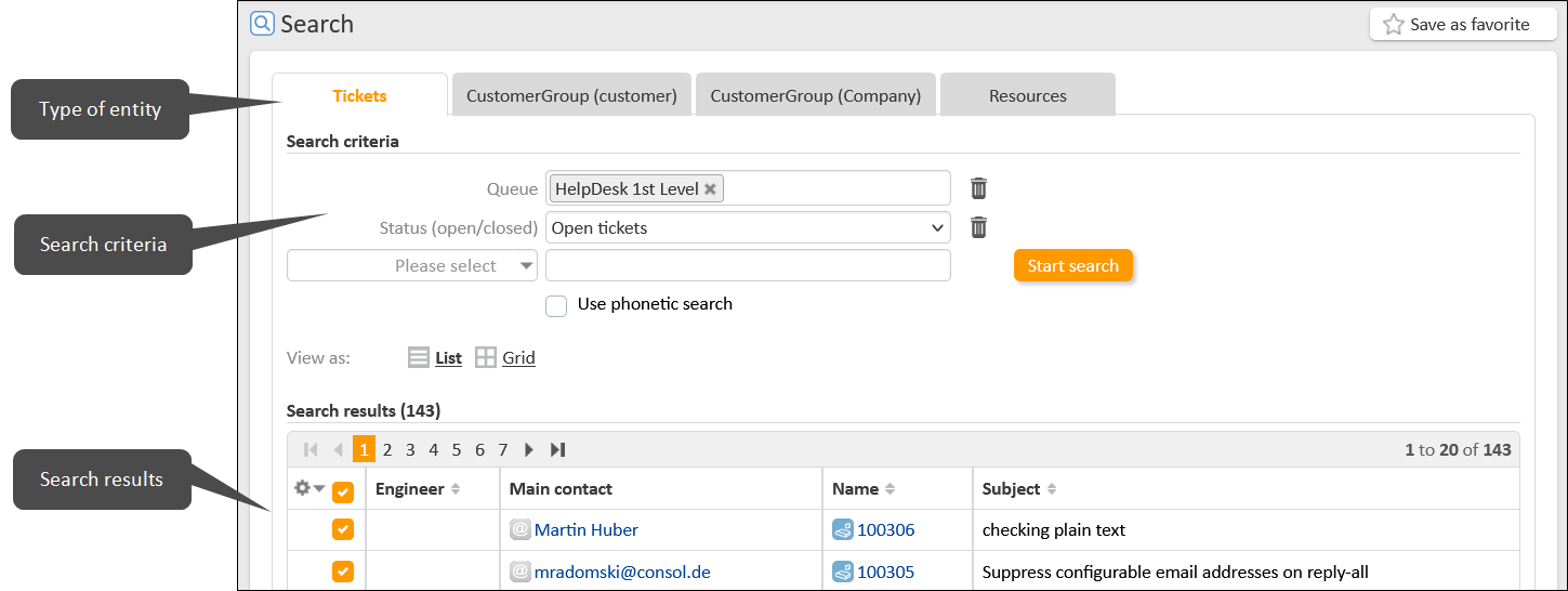
The layout of the detail search has been improved by moving the entity tabs to the top. This indicates to the users that they should first select the type of entity which they search for (cases, contacts or resources) before entering search criteria, as the search criteria depend on the type of entity.

Better wording in detail search (#659346)
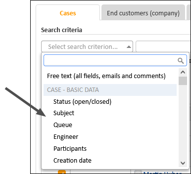
The selector where the user can choose a search criterion for the detail search has been renamed to Select search criterion... to clarify its meaning.
Order of the detail search criteria adjusted (#659359, #659385)
The order of the available search criteria which are shown when clicking the criteria selector on the detail search page has been adjusted so that the frequently used criteria are shown first.
In addition, the criteria which apply to the selected tab are shown first, i.e. when you are on the Cases tab, the case criteria are shown at the top, and when you are on a customer group tab, the criteria for the respective contact object are shown at the top.

Unused search criteria hidden (#659386)
The detail search has been streamlined by hiding the unused search criteria which allowed to search for a contact by another contact which has at least one case assignment in common.
The page customization attribute unitSearchByTicketUnitAssignmentEnabled has been added to the scope detailSearch to restore these search criteria if they are urgently needed.
The hidden criteria are deprecated and will be removed in a future version of ConSol CM
Headline styling improved (#659414)
The font size and spacing of headlines in comments have been adjusted to provide a proportional appearance and improve content separation and readability.
All entities shown when opening detail search (#660445)
When accessing the detail search, the cases and contacts are directly displayed when opening the respective tabs. Therefore, the users see some data immediately, which they can then filter according to their needs by adding search criteria. The results are sorted by creation date.
Rounded logo (#660993)
The new ConSol CM logo with rounded corners is now used for the favicon and on the internal start page.
Quicker folding of sidebars on mobile devices (#661366)
The sidebars which hold the case list workflow activities, favorites and workspace are collapsed automatically on mobile resolutions. The folding is now done before loading the entire page content, so that it is quicker.
New history entry for scope restore (#661829)
When a case leaves its scope due to an interrupt and returns to its previous scope afterwards, an entry that the scope has been restored is now written to the case history. Therefore, the last scope mentioned in the case history is always the current scope stated in the case header. This makes it easier to track the case status and understand the workflow.
Rounded corners for field in detail search (#662038)
The Group by field, which is show in the grid view of the detail search now has rounded corners in line with the overall layout.
Capitalization in widget action buttons adjusted (#662175)
The action buttons for showing all entries in the Recently visited and Recent changes widgets are now labeled Show all, starting with a capital letter, to be consistent with the other buttons in the application.
Rounded corners for form management (#662413)
The Generate and Increment buttons on the Forms page now have rounded corners in line with the overall layout.